For the past 6 weeks my church has been conducting a sermon series reexamining scripture through art, and I've been given the somewhat unique opportunity to preach!
This sunday I'll be giving the sermon, entitled "Great! ...Now Back to the Drawing Board." I'm hoping to bring a contemporary artist's perspective to the discussion, and the sermon will draw on my experience in the MFA program to reexamine the story of the Tower of Babel as a model for the life of faith.
Contact me for info if you'd like to come, and I'll be sure to post a recording of the sermon after!
Thursday, October 25, 2012
Saturday, October 20, 2012
Centering into CyberSpace
Though I've been negligent in posting about it, I've been working on another series of drawings all the while, prompted by a call for works for a "works on paper" show. I was wondering what I could do on paper that would have any conceptual integrity within the realm of my other work. This is what I landed on (still a work in progress):

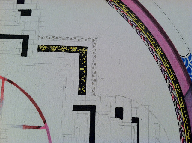
I decided to start a series of Mandalas that are conflated with a QR code (that square barcode thing you see everywhere and can scan with your phone). Formally they share some interesting parallels, but moreover I was enamored with the idea that in trying to use the mandala as a meditative tool, one could only truly complete this meditation by pulling out their phone and scanning it!
I remember years ago my church cleverly instructed people to silence their phones during the service by including a note in the bulletin that said "If God is calling you, it won't be on your cell phone." Though I appreciate the wit, my inner postmodern theologian was appalled to think that God couldn't use a cell phone (especially if he could use movable type back in Gutenberg's day, or powerpoint in the age of the contemporary megachurch...). Why should technology be quarantined into this artificial prison of secularity? Are not the trees or breathtaking mountaintops also mediators for encountering God? What then draws this line before digital mediation?
Anyway, I began by researching the mandala tradition and selected the Yamantaka Mandala as my general template. There are many forms of mandala, but this one is essentially a cosmological diagram moving from our earthly realm at the outside edges toward nirvana at the center, with Yamantaka (the conqueror of death) represented symbolically. So I began developing my own postmodern Christian cosmology, and appropriating/creating symbols to be used. I've also taken quite adamantly to making its creation a spiritual and meditative process. That can't be lost, I think, and still end up with anything with any power when viewed. Granted I'm not making it out of sand and then throwing it to the wind upon completion, but I won't work on it without first closing my studio door, setting the lighting to a warm ambiance, playing something meditative (like Radiohead) on my computer, praying, and then picking up my pen.

The QR code at the center, hand drawn but entirely functional, directs the user to a random website, different every time it's scanned. Conventionally, one would expect the grand "a-ha" moment at the center of the mandala. This ironically anti-climactic output at first may seem a let down, but upon further inspection, it urges the viewer to consider the possiblity that any destination is just as valid as any other as an "a-ha" moment, since postmodernism rejects the idea that there is a sacred inside dualistically opposed to a secular outside. Rather, everything is spiritual. Furthermore, the outside of the mandala can no longer be sloughed off as undesirable since the viewer comes to see that the inside is actually the same as the outside, but just with a newly informed perspective. On yet another level, it is only by embracing a journey into cyberspace that one can come to this realization.

It's been quite a mental exercise trying to figure out visual analogies. Many are blatantly playful and ironic, like the rainbow outer ring of the 5 elements that I replaced with Mac's spinning pinwheel of death, or the Vajra lightning bolt symbol that I replaced with the USB port symbol. The masks guarding the 4 gates are a mash up of the all-seeing eye and the firewire symbol. However, now, I'm really struggling to find the right symbols to complete it. I've reached the crucial tipping point where I don't want to fall off into being entirely tongue-in-cheek, but I also don't want it to be completely dissimilar to the vocabulary I've built thus far... Much to ponder as I continue working.


I intend to do a series of these, with different QR codes. Some may be more visually integrated (so that the whole mandala is the code), and others will be self referential (maybe the code takes you from one mandala to another, or helps complete or negate another existing mandala).
Well, I know that was a long post, but it's been several weeks of working on this without posting, so I thought it was about time!

I decided to start a series of Mandalas that are conflated with a QR code (that square barcode thing you see everywhere and can scan with your phone). Formally they share some interesting parallels, but moreover I was enamored with the idea that in trying to use the mandala as a meditative tool, one could only truly complete this meditation by pulling out their phone and scanning it!
I remember years ago my church cleverly instructed people to silence their phones during the service by including a note in the bulletin that said "If God is calling you, it won't be on your cell phone." Though I appreciate the wit, my inner postmodern theologian was appalled to think that God couldn't use a cell phone (especially if he could use movable type back in Gutenberg's day, or powerpoint in the age of the contemporary megachurch...). Why should technology be quarantined into this artificial prison of secularity? Are not the trees or breathtaking mountaintops also mediators for encountering God? What then draws this line before digital mediation?
Anyway, I began by researching the mandala tradition and selected the Yamantaka Mandala as my general template. There are many forms of mandala, but this one is essentially a cosmological diagram moving from our earthly realm at the outside edges toward nirvana at the center, with Yamantaka (the conqueror of death) represented symbolically. So I began developing my own postmodern Christian cosmology, and appropriating/creating symbols to be used. I've also taken quite adamantly to making its creation a spiritual and meditative process. That can't be lost, I think, and still end up with anything with any power when viewed. Granted I'm not making it out of sand and then throwing it to the wind upon completion, but I won't work on it without first closing my studio door, setting the lighting to a warm ambiance, playing something meditative (like Radiohead) on my computer, praying, and then picking up my pen.

The QR code at the center, hand drawn but entirely functional, directs the user to a random website, different every time it's scanned. Conventionally, one would expect the grand "a-ha" moment at the center of the mandala. This ironically anti-climactic output at first may seem a let down, but upon further inspection, it urges the viewer to consider the possiblity that any destination is just as valid as any other as an "a-ha" moment, since postmodernism rejects the idea that there is a sacred inside dualistically opposed to a secular outside. Rather, everything is spiritual. Furthermore, the outside of the mandala can no longer be sloughed off as undesirable since the viewer comes to see that the inside is actually the same as the outside, but just with a newly informed perspective. On yet another level, it is only by embracing a journey into cyberspace that one can come to this realization.

 |
| yes, those are 1.5 mm squares in that grid |


I intend to do a series of these, with different QR codes. Some may be more visually integrated (so that the whole mandala is the code), and others will be self referential (maybe the code takes you from one mandala to another, or helps complete or negate another existing mandala).
Well, I know that was a long post, but it's been several weeks of working on this without posting, so I thought it was about time!
Friday, October 19, 2012
More Projection Negation Experiments
Following my last experimentation, I wanted to try to get closer to a neutral gray and use two colors instead of one. I painted a circle on the wall, one side blue the other gray. By then projecting orange and a lighter gray on a darker gray background, it neutralizes out to that gray of the background. Getting closer to a functional negation!


Wednesday, October 17, 2012
Apophatic Projection
More optics experiments - today I achieved visual negation! Starting with a yellow square painted on the wall, I then projected a violet square on top of it (which looks blue in the video). The resulting color mixture yields a gray-green (which looks positively pea green in the video. slightly less so in real life, though still not as gray as I'd like... stupid color calibrations). I then matched that optical color with the color to be projected as a background.
The result: the yellow square disappears into the background. Check it out!
After an excellent studio visit with projection mapping guru John Ensor Parker, I'm psyched to continue exploring these projection possibilities!
Sunday, October 14, 2012
New CONVERSATIONS Section on my Website
I've posted a new section on my website entitled "Conversations" under my "Projects" tab. Here you can find interviews and discussions I've conducted with some of the leading thinkers and artists in my field. It will be an ever-expanding portion of my site, but I've got 4 conversations posted thus far.
Go ahead and check it out!
Enjoy!
Go ahead and check it out!
Enjoy!
Thursday, October 4, 2012
Optics Experiments
In trying to build an arsenal of visual tricks and tools to use in projection projects, I've begun a series of optics experiments. Ultimately my goal is to uncover some ways to create a visual negation that can go hand and hand with the mystical concept of apophatic negation.
I started by reconstructing an experiment by Maurice Merleau-Ponty in his Phenomenology of Perception. This box with two eyeholes has two compartments, one for each eye. The left eye is looking into a poorly lit white compartment, while the right eye is looking into a well lit black compartment. The optical result is that each compartment is seen as a somewhat neutral gray and therefore evens out into one gray visual plane.


I started by reconstructing an experiment by Maurice Merleau-Ponty in his Phenomenology of Perception. This box with two eyeholes has two compartments, one for each eye. The left eye is looking into a poorly lit white compartment, while the right eye is looking into a well lit black compartment. The optical result is that each compartment is seen as a somewhat neutral gray and therefore evens out into one gray visual plane.

Next to it I made a color wheel (which was quite a throwback to high school!), which I then photographed and projected onto itself.
 |
| color wheel on wall |
 |
| projected directly onto itself |
My expectation was that I would find some quirky color theory stuff happening with the mixing of additive and subtractive color (light and paint). Much to my surprise, it actually behaved in a largely subtractive manner (with the exception that adding like colors of different values the saturation seemed to be enhanced regardless). Though seemingly not quite as exciting as I hoped, it actually proves quite promising because it means I can follow the normal rules of subtractive color mixing. Therefore, projecting a color onto its complement does indeed, when calibrated correctly, yield gray.
 |
| color wheel, inverted, and projected onto itself (thus mixing complements) |
So, by projecting or painting the background gray, I could then project a color onto its complement in order to gray it out and make it disappear visually.


 |
| the paper covering at bottom reveals the true orange of the projected image, and the shadow at top reveals the true blue of the painted image. The space in between is the gray that results when the two are mixed |
Here are some short clips of my tinkering:
Subscribe to:
Posts (Atom)